Food Experience & Sensory Testing
Taking a bite out of sensory science branding
When the Food Experience and Sensory Testing (FEAST) facility at Massey University needed a new logo, I went all in and gave them a new brand that they fully embraced. Located at their Manawatū campus, FEAST is a hub for food sensory and consumer research, training and consultancy.
The requirement of the brand was to visually describe FEAST as a New Zealand food sensory testing facility without being cliche. A New Zealand map was not allowed! The colours needed to be Massey University gold and a support colour of my choosing.
Project Scope
Branding
Primary and secondary logo
Brand mark
Brand style guide document
Print
Exhibition Table
Marketing Materials
Stationery
Promo Banners


Designed for all the senses
First, I started with the type. I chose a sans-serif font that had serif elements to it. I altered the text so that the ‘f’ and the ‘t’ are interchangeable. This represents the balance of the senses. Above and below the type are two toothpicks. Toothpicks are used within FEAST to pick up food samples. To add visual appeal and to link to FEAST's relationship with food, I surrounded the logo with a palate-cleansing cracker circle. A bite is taken out of the cracker, with the crumbs forming the Southern Cross star constellation. This was a great way to link the facility to New Zealand without being cliche.
The brand rollout for FEAST included the following:
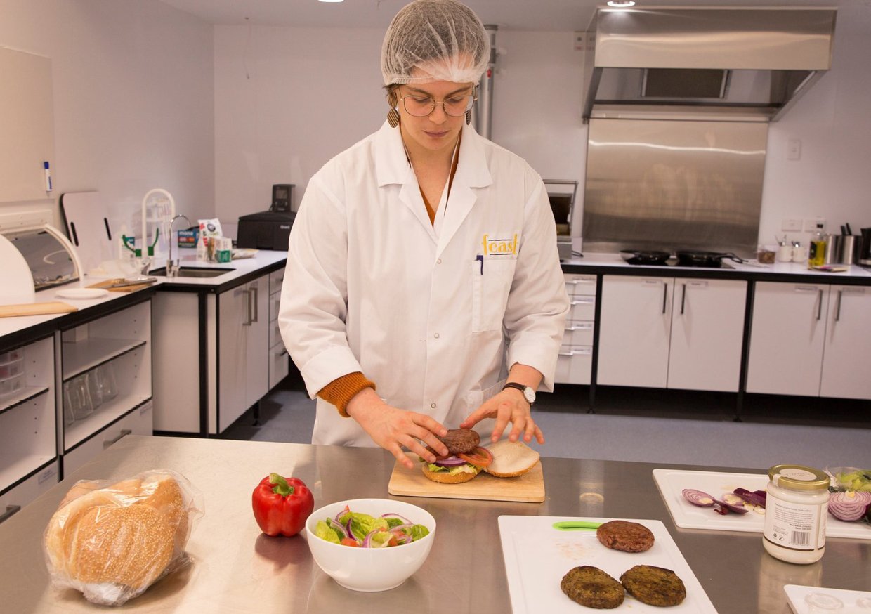
lab coats with the FEAST logo
stationary, including business cards and pens
banners and a table sleeve for exhibitions and events